By default, all colors in the visualization, including the legend, are determined by the given report theme. The association between an item in the legend and its corresponding data point in the visual is a called a "series." Each series can be edited, allowing users to customize the color and line type for a given legend item and the analogous data point.
Legend to Chart Relationship
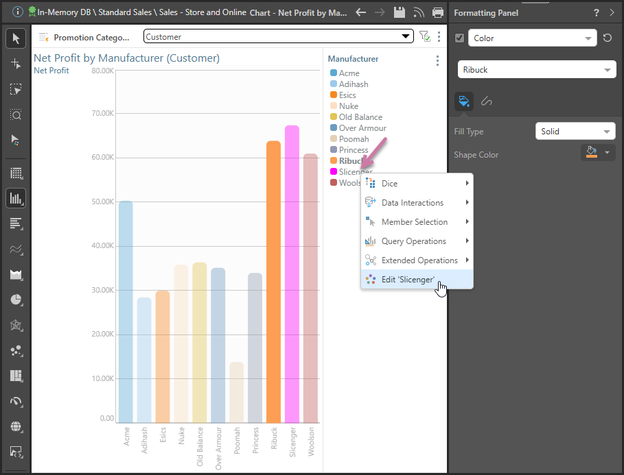
Series editing offers the flexibility to override theme colors for the given series, without changing the theme itself. For example, in the image below the Slicenger series was changed from pale gray to bright pink:
Note: You can change the color of your series by right-clicking the item in the legend and selecting Edit from the context menu.
Discrete Legend
A discrete legend is a list of elements or measures, which are color-coded using the color from the visualization (orange box above). Whenever a hierarchy or list of elements is added to the color or shape zone, a discrete legend is produced.
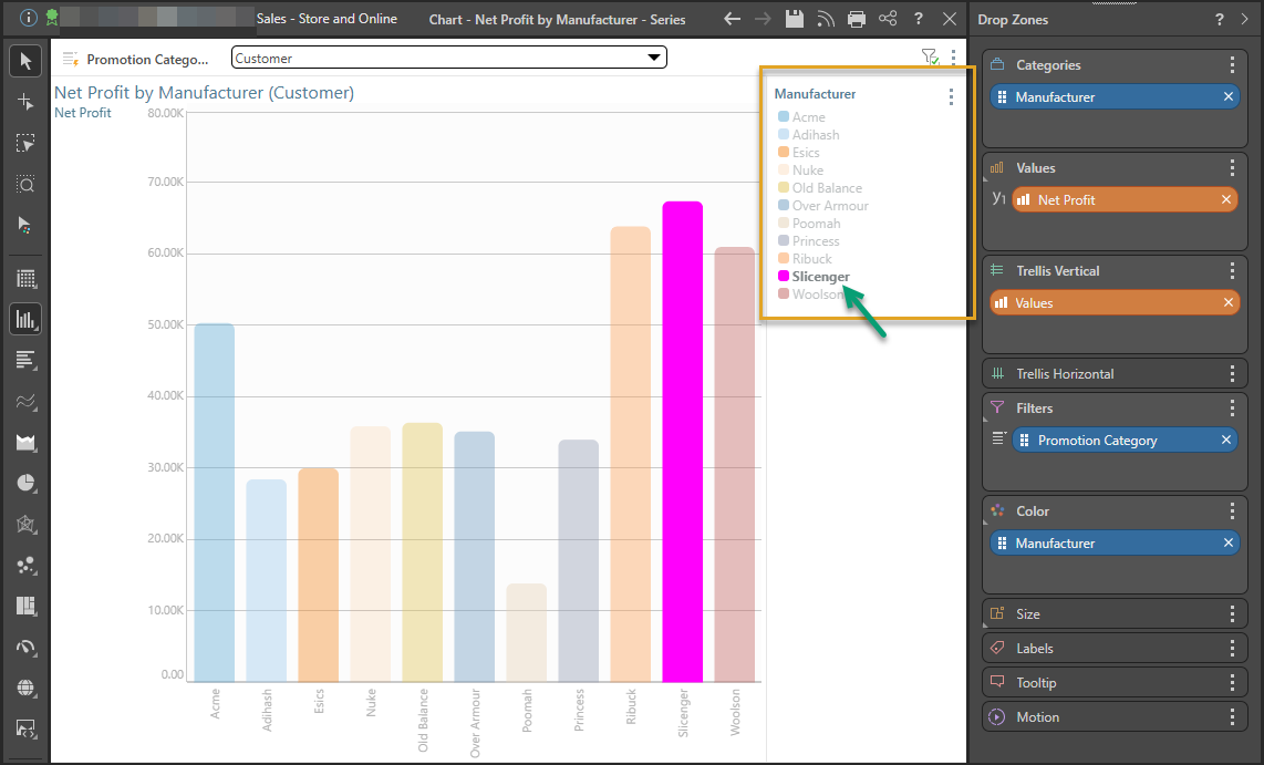
Edit Data Series
Formatting Panel
To change the data series:
- Select the series on the canvas (green arrow above) and right-click Edit to open the Formatting panel.
- With the Formatting panel open, select Color from the dropdown menu (orange arrow below), then select the series whose color you want to change from the next dropdown menu (blue arrow):
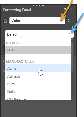
Note: You can apply your changes to all series in the visual, or to a given series only. To apply changes to all, choose Default from the dropdown list (blue arrow above). To set changes for a specified series only, choose the series name from the hierarchy dropdown list. For example, to change the line style for the Acme only.
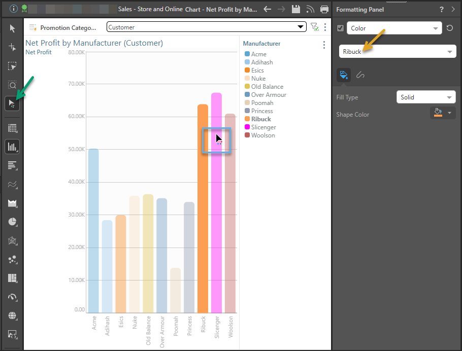
Formatting Selector
Alternatively, you can enable the formatting selector (green arrow below), click the series you want to edit directly in the visual (blue box), and then make use of the Formatting panel options. Note that your selected item is shown in the Formatting panel (orange arrow).
Series Context Menu
Right-click the relevant series in the legend; from its context menu click the Edit option (purple arrow below).
Series Formatting Options
From the Color sub-category of the Formatting panel, you can edit the data series that you've selected from the tabs: Fill and Line.
Fill (Color)
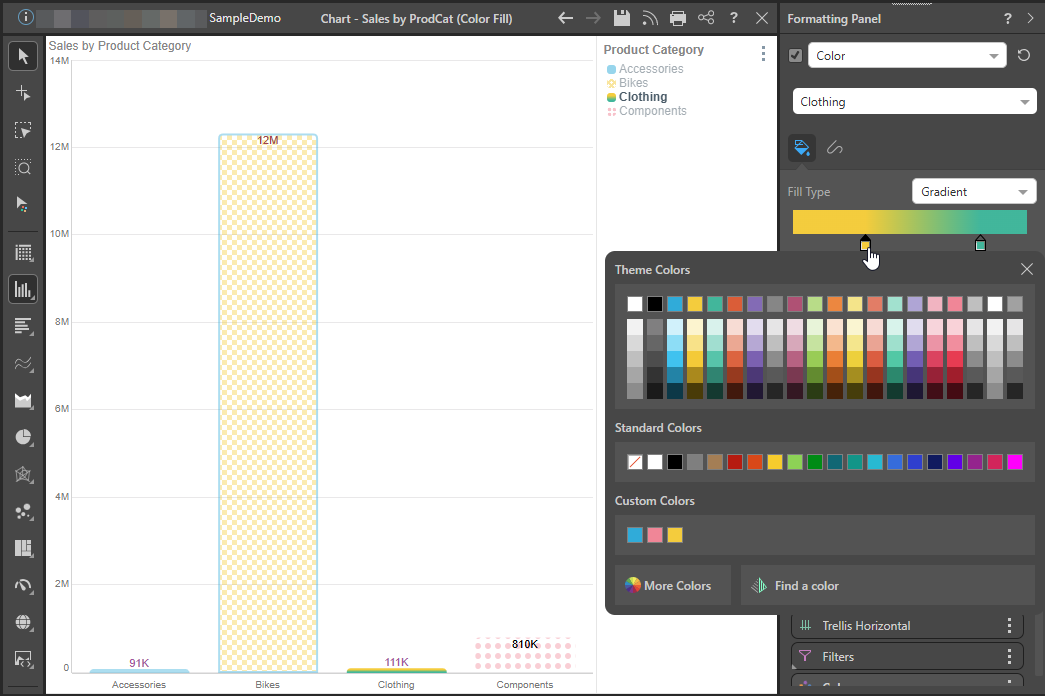
The options in the fill tab allow you to change the Fill Type (and Pattern, where the Pattern fill type is selected) and Color. The Target dropdown list (purple arrow) indicates whether your changes apply "by default" or only to one of the items in the visual (in the following case, the Bikes column).
Note: Your selected Color and Fill Type apply to both the shape in your visual and, where applicable, its legend.
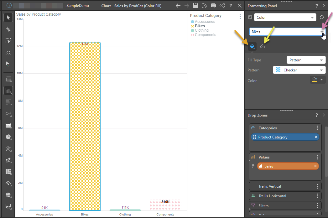
Fill Type
- Solid: Fill your shape with a single solid color.
- Pattern: Fill your shape with a "pattern." This is particularly useful if your corporate branding requires a limited color palette or if you require patterns to fulfill your accessibility guidelines. Select this option to open an additional dropdown list offering the following pattern types:
- Dotted.
- Checker.
- Diagonal stripes.
- Horizontal stripes.
- Gradient: Click the paint pots to open the Color Picker and choose the start and end colors for your gradient. Once selected, you can move the paint pots closer together or further apart to set the range of the gradient.
Color
Set the fill and default shape outline color. Use the Color Picker to select the appropriate color.
Tip: Each of these selections can be individually overridden from Shapes.
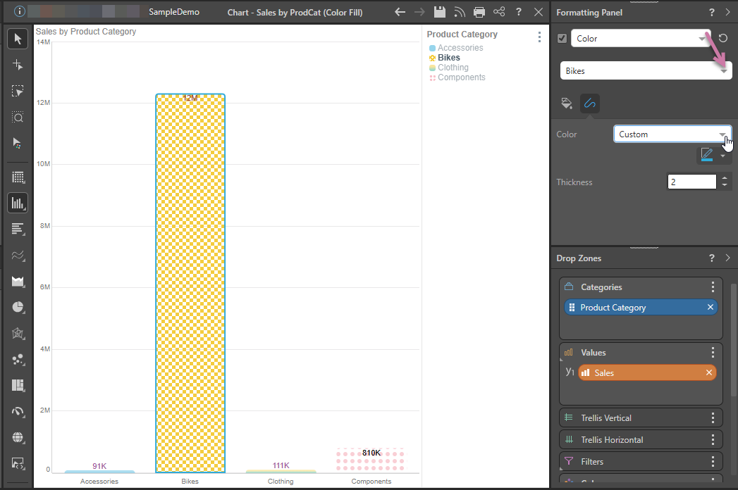
Line
The Line tab contains options for customizing the line color, width, and style of the line. The Target dropdown list (purple arrow) indicates whether your changes apply "by default" or only to one of the items in the visual (in the following case, to the Bikes column):
The following options from the Line tab are for Cartesian charts:
- Color: Set the color of the line. This option does not appear for line or radar charts.
- Data Point Color: By default, the line color is the same color as the data point.
- Custom: Select a different line color from the color picker.
- Thickness: Change the thickness of the line.
The following options from the Line tab are for line, area, and radar charts:
- Thickness: Set the thickness of the line.
- Line Style: The default line style is solid, but you can change it to a dotted or dashed line.
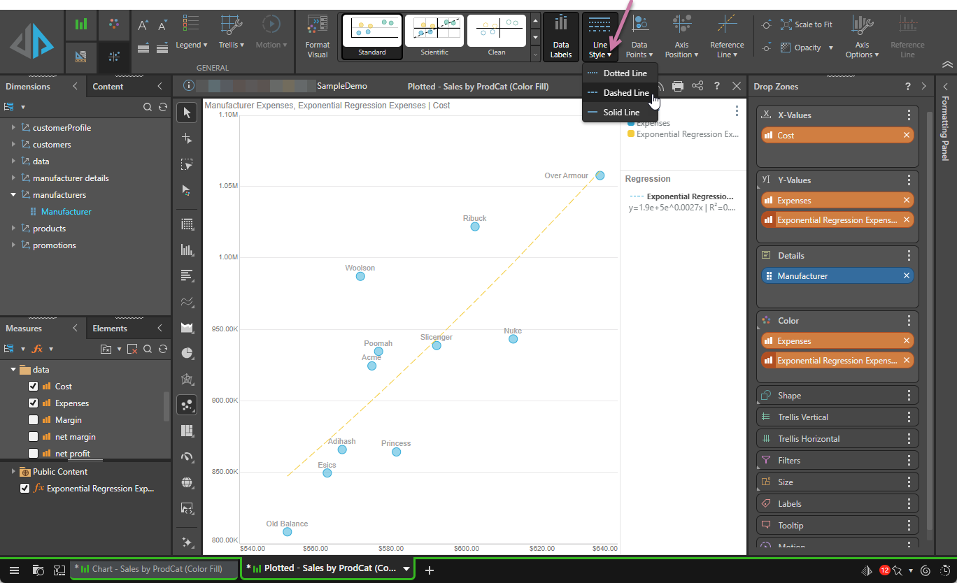
Component Ribbon
For line, area, radar, or, where they contain a regression line, plotted charts, the line style can also be set from the Line Style dropdown list (purple arrow below) on the Component ribbon:
Examples
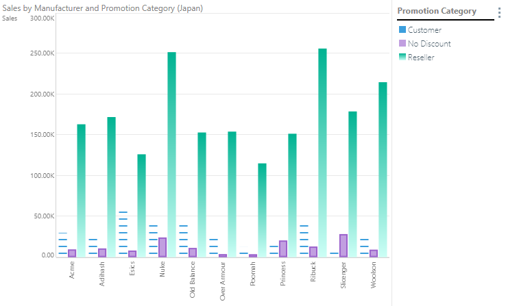
In this example, the color was changed for each series. The Customer series' fill was then changed to the horizontal stripes pattern; a border was added to the No Discount series; and the Reseller series' fill was changed to a gradient.
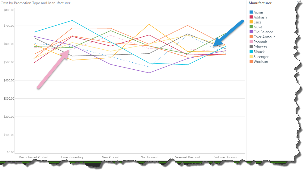
In the image below, the default solid line style is applied to all series members except two; a dashed line was applied to the Poomah series (pink arrow) and a dotted line to the Acme series (blue arrow).